Top 10 Web Design Latest Trends and Techniques in 2023
1. Introduction:
The world of web design is dynamic and ever-evolving, constantly pushing boundaries and embracing new technologies. As we enter 2023, web designers and developers must stay ahead of the curve and be aware of the latest trends and techniques shaping the industry. In this cornerstone content, we will explore the cutting-edge web design trends gaining momentum and the innovative methods that are revolutionizing how we create online experiences.
2. Dark Mode: A Sleek and Modern Aesthetic:
Dark Mode is a user interface (UI) design trend that has gained immense popularity recently and is expected to continue evolving as a prominent feature of future web design trends and techniques in 2023. It offers users an alternative color scheme for websites, applications, and operating systems, presenting a darker background with lighter text and graphics. This shift from the traditional light mode to a darker appearance has captivated users and designers alike, with numerous benefits and considerations to explore.
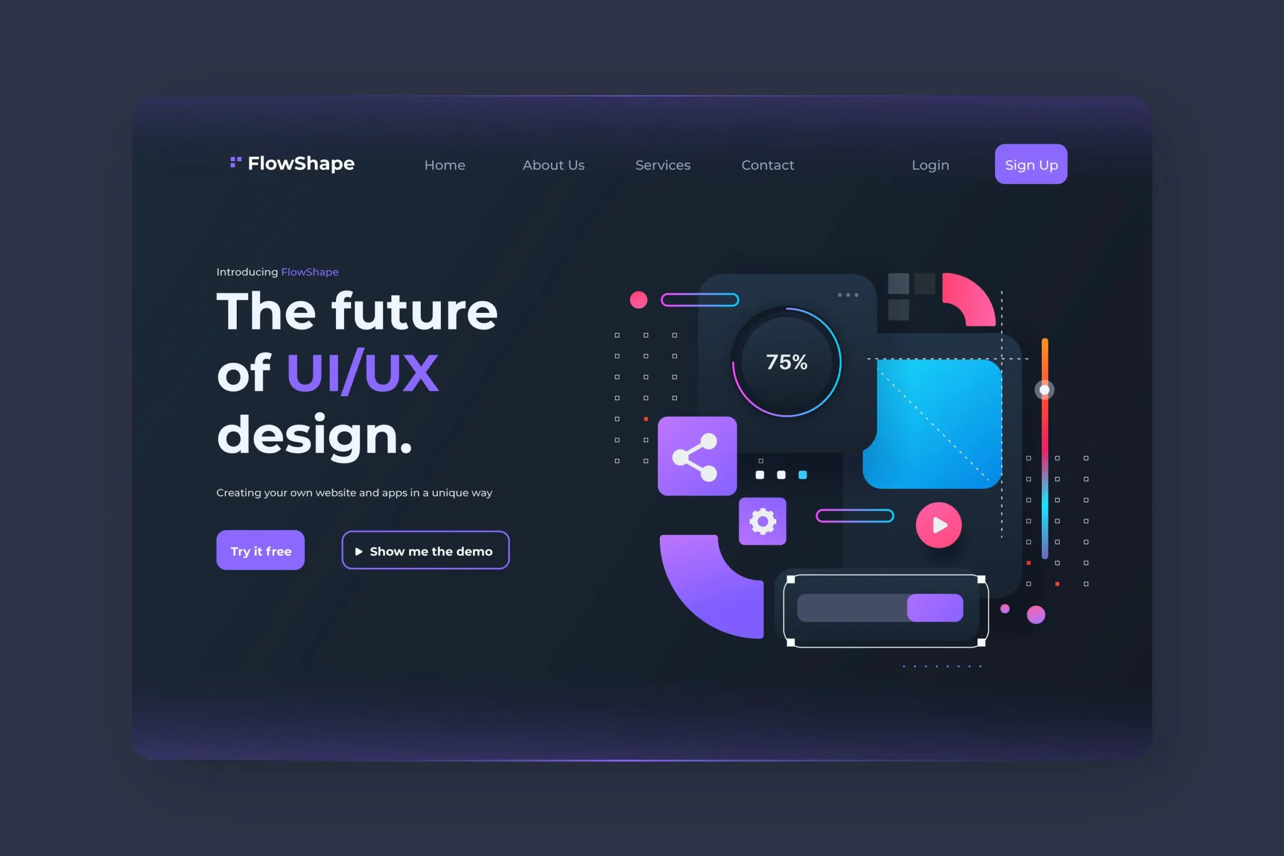
Characteristics of Dark Mode:
- Reduced Eye Strain:
Dark Mode’s subdued colors and lower screen brightness minimize eye strain, particularly in low-light conditions. It’s especially beneficial for users who spend extended time on digital devices, improving comfort and readability.
- Enhanced Visibility:
In Dark Mode, bright elements like text and icons stand out vividly against the dark background, making them easier to see and interact with. This heightened contrast enhances visual clarity and user experience.
- Battery Savings (for OLED screens):
OLED screens power off individual pixels in Dark Mode, saving power for devices with such displays. OLED technology improves battery life on smartphones, tablets, and laptops.
- Modern and Stylish Aesthetic:
Dark Mode exudes a sense of modernity and sophistication, making it appealing to users who prefer sleek and elegant design aesthetics. Many apps and websites have adopted Dark Mode to align with contemporary design trends.
- Accessibility:
For users with visual impairments or sensitivity to bright light, Dark Mode offers a more accessible and comfortable viewing experience.
Advantages of Dark Mode:
- Visual Appeal:
Dark Mode’s elegant and sophisticated appearance adds a touch of modernity and aesthetic appeal to websites and applications, enhancing the overall user experience.
- Eye-Friendly:
The reduced screen brightness in Dark Mode can significantly reduce eye strain and fatigue, particularly during extended device usage, resulting in a more comfortable and enjoyable browsing experience.
- Enhanced Focus on Content:
Dark Mode’s high contrast and subdued background put the content at the forefront, directing users’ attention to the main elements of the page or application.
- Battery Conservation:
Dark Mode can extend battery life for devices with OLED screens by utilizing less power to display darker pixels.
Design Challenges & Considerations:
- Consistency and Usability:
If you decide to implement Dark Mode, ensuring consistency across your platform is essential. Users should easily switch between modes, and the interface should remain intuitive and user-friendly in both light and dark versions.
- Content Legibility:
Although Dark Mode can enhance readability, it requires careful consideration of text and graphic colors. The contrast between the background and content must be sufficient to maintain legibility and prevent eye strain.
- Branding and Visual Identity:
If your platform has well-established branding with specific color schemes, adapt the dark version to align with your brand’s aesthetics. Ensure that brand colors remain recognizable and consistent across both modes.
- User Preferences:
Users can choose between Dark Mode and Light Mode based on their preferences. A toggle or automatic mode selection based on device settings ensures a personalized experience.
- Testing and Feedback:
Before implementing Dark Mode, conduct usability testing and gather user feedback to identify any issues or areas for improvement. Valuable insights from users can help refine the design and optimize the experience.
As Dark Mode continues to be a popular design choice, web designers may find new ways to innovate and experiment with this aesthetic. Customizable Dark Mode themes, interactive transitions between modes, and improved color management for accessibility may become more prevalent in web design 2023.
Furthermore, integrating advanced technologies such as AI and machine learning may enable websites and applications to adapt Dark Mode based on user preferences and behavior, creating a truly personalized experience.
Dark Mode has emerged as a popular and user-friendly web design trend that offers a sleek and modern aesthetic. Its advantages in reducing eye strain, enhancing visibility, and conserving battery power have made it a preferred choice for users and designers. As web design evolves in 2023, Dark Mode is expected to remain a prominent feature, with technological advancements allowing for further customization and personalization to cater to users’ preferences and needs.
3. Neumorphism/Soft UI: Merging Realism and Minimalism:
Neumorphism, also known as Soft UI (User Interface), is a web design trend that combines realism and minimalism to create visually appealing and intuitive user interfaces. This emerging design style draws inspiration from skeuomorphism, a design approach that imitates real-world objects and textures, and flat design, which emphasizes simplicity and minimalism.
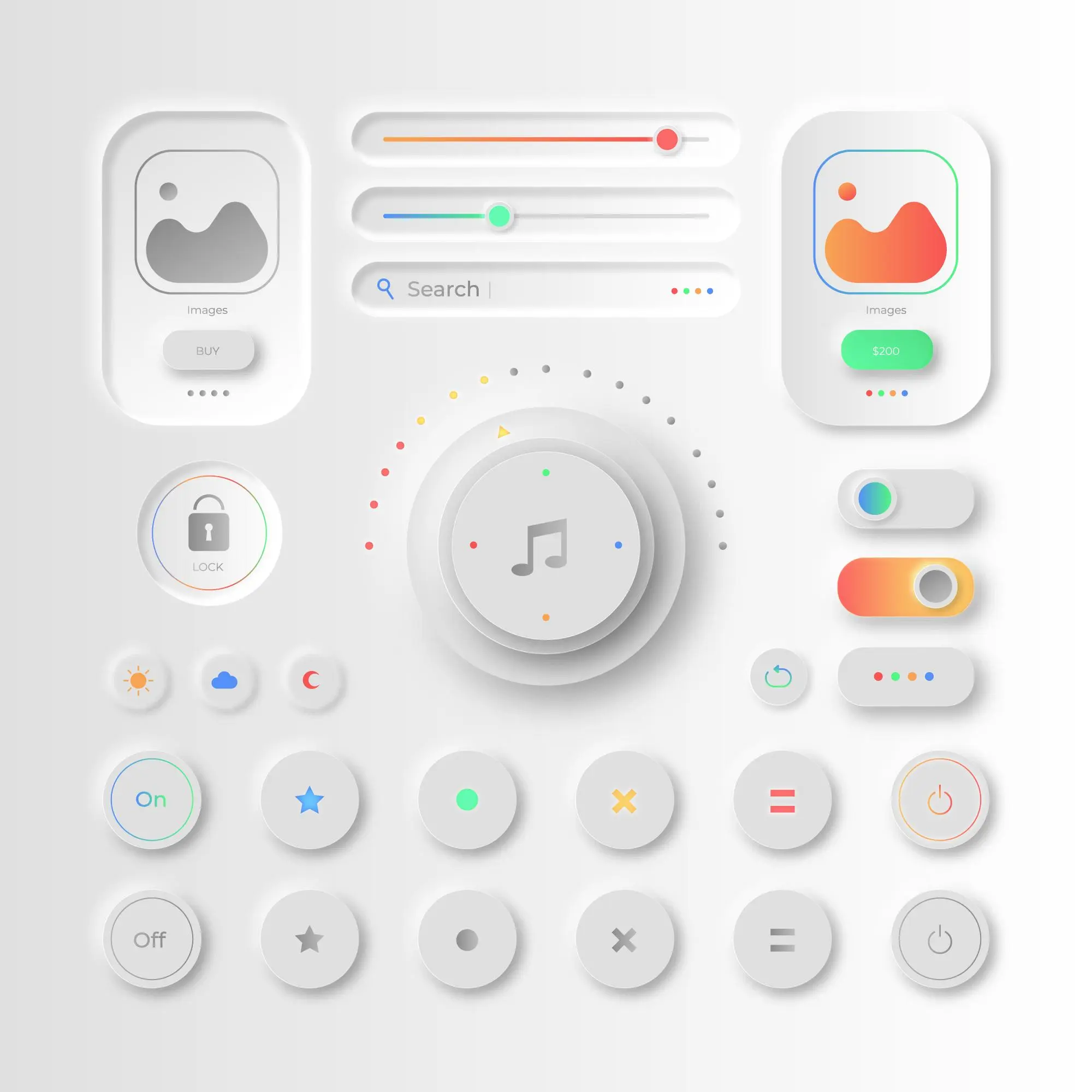
Characteristics of Neumorphism/Soft UI:
- Subtle Depth and Shadows:
Neumorphic designs incorporate subtle shadows and highlights to create the illusion of elements protruding or sinking into the background. This effect gives the interface a three-dimensional and tactile appearance, resembling physical objects on a digital platform.
- Minimalistic Aesthetics:
Despite its realistic elements, Neumorphism retains the essence of minimalism. It avoids excessive embellishments and focuses on simplicity and clean lines, ensuring the interface remains uncluttered and easy to navigate.
- Soft Edges and Blurring:
Elements in Neumorphic designs often have soft edges and blurred boundaries, enhancing the sense of realism and blending seamlessly into the background. This softness adds a touch of elegance to the overall aesthetic.
- Light and Dark Modes:
Neumorphism is versatile, as it can be adapted to light and dark colour schemes. In light Mode, elements cast soft shadows, while in dark Mode, they appear as slightly illuminated shapes, offering an aesthetically pleasing experience in both scenarios.
- Focus on User Interaction:
The Neumorphic design approach emphasizes user interaction. Buttons and elements often react to user actions with subtle changes in shadows or highlights, providing visual feedback and enhancing the sense of interactivity.
Advantages of Neumorphism/Soft UI:
- Enhanced User Engagement:
The subtle depth and realistic appearance of Neumorphic designs make interfaces more engaging and inviting for users, encouraging them to explore and interact with the elements.
- Improved Usability:
Despite its realistic elements, Neumorphism maintains the simplicity of flat design, ensuring that users can easily navigate through the interface and complete tasks without distractions.
- Branding and Differentiation:
Neumorphism offers a unique and distinctive visual style, allowing brands and products to stand out in a crowded digital landscape.
- Appealing to Users’ Sensory Perceptions:
The soft and tactile nature of Neumorphic designs creates a sense of comfort and familiarity akin to physical objects, which can resonate with users on a sensory level.
Challenges and Considerations:
- Visual Clarity:
Neumorphism’s soft and subtle effects can sometimes lead to reduced visual contrast, affecting content legibility. Designers need to ensure that elements maintain sufficient contrast for optimal readability.
- Responsive Web Design:
Implementing Neumorphism in Responsive Design requires careful consideration, as complex shadows and highlights may not scale well on smaller screens or different devices.
- Accessibility:
Designers must pay attention to colour contrast and ensure the design remains accessible to visually impaired users.
Neumorphism is expected to continue being a prevalent web design trend in 2023 as designers explore new ways to refine and expand its application. With advancements in CSS and web technologies, designers may have more flexibility in achieving realistic Neumorphic effects across various devices and screen sizes. Furthermore, integrating immersive technologies like AR and VR may present exciting opportunities to enhance Neumorphic designs, creating more interactive and engaging user experiences.
Neumorphism/Soft UI represents an innovative and visually captivating design trend combining realism and minimalism. Its subtle depth, tactile appearance, and focus on user interaction enhance user engagement and improved usability. As web design evolves in 2023, Neumorphism is expected to continue its growth as a prominent design style, providing web designers with a compelling option to create visually striking and user-friendly interfaces.
4. Asymmetric Layouts: Breaking the Grid:
Asymmetric layouts, broken grid layouts, are a web design trend that challenges the traditional grid-based design approach. Instead of adhering to a rigid and symmetrical grid system, asymmetric layouts intentionally deviate from the predictable alignment of elements, creating dynamic and visually engaging compositions. This design trend has gained traction recently and is expected to evolve as a prominent feature of future web design in 2023 and beyond.
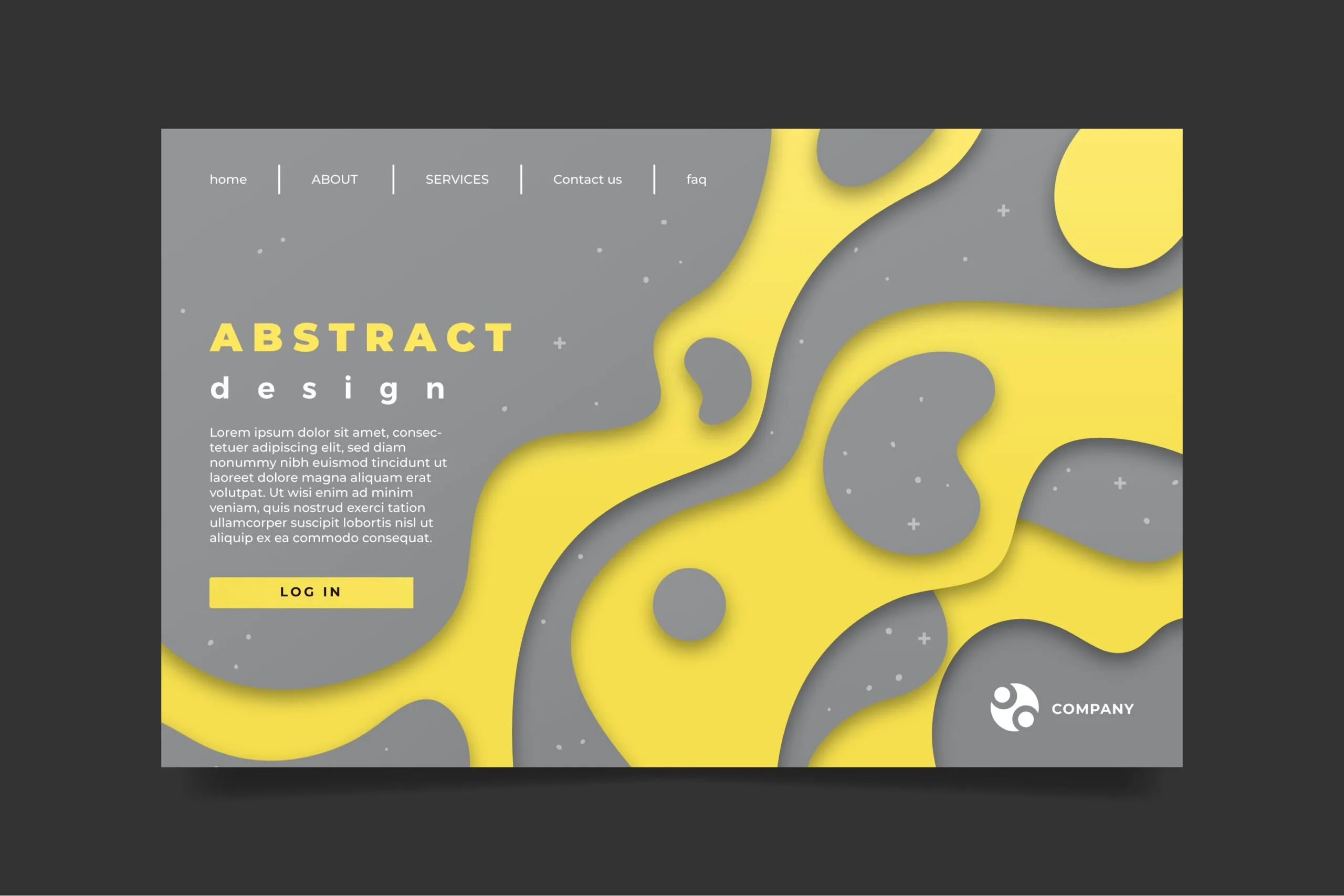
Image above shows asymmetric layout. Check Live Example: Asymmetric Website DeveloperHub
Characteristics of Asymmetric Layouts:
- Dynamic Visual Balance:
Asymmetric layouts introduce a sense of movement and visual interest by using varying sizes, shapes, and positions for different elements on the page. This creates a dynamic visual balance, drawing attention to specific features and guiding the user’s eye through the content.
- Emphasis on Creativity:
By breaking free from the confines of a strict grid, designers can explore more creative and innovative design solutions. Asymmetric layouts encourage experimentation, allowing designers to craft unique and memorable web experiences.
- Artistic and Expressive:
Asymmetric layouts often exhibit artistic qualities and evoke emotions, making them suitable for websites that convey a specific mood or brand identity. They can capture a visitor’s attention, leaving a lasting impression and fostering a deeper connection with the content.
- Responsive-Friendly:
Asymmetry can adapt well to responsive design. Since elements are not constrained to fixed positions, they can reorganize and resize fluidly on various devices without compromising the design’s integrity.
Advantages of Asymmetric Layouts:
- Visual Engagement:
The dynamic and unconventional nature of asymmetric layouts grabs users’ attention and encourages exploration. It breaks away from the predictable monotony of traditional grid-based designs, making the website more memorable and engaging.
- Uniqueness and Differentiation:
Asymmetric layouts enable brands and websites to stand out in visually similar designs. By embracing this non-conformist approach, a website can create a distinct identity and leave a strong impression on its audience.
- Enhanced Storytelling:
Asymmetry allows designers to arrange content to complement the flow of storytelling. It can guide users’ visual journey through the page, emphasizing key elements and building a narrative.
Challenges and Considerations:
- Visual Cohesion:
Achieving visual balance and coherence in asymmetric layouts can be challenging. Designers need to strike a careful balance between creative freedom and maintaining a cohesive design that feels smooth and clear.
- Content Hierarchy:
Asymmetric layouts may require thoughtful consideration of content hierarchy to ensure that critical information is effectively highlighted and easy to find.
- Cross-Browser Compatibility:
Implementing asymmetric layouts can present compatibility issues across different browsers and devices. Thorough testing and fallback options are necessary to ensure a consistent experience for all users.
Asymmetric layouts are expected to continue being a prevalent web design trend in 2023 and beyond as designers explore new ways to break the grid and create unique visual experiences. Advancements in CSS and web technologies will likely facilitate even more dynamic and interactive asymmetric layouts.
Additionally, integrating asymmetric designs with immersive technologies such as AR and VR may open up exciting possibilities for creating captivating web experiences.
Asymmetric layouts depart from traditional grid-based design, offering a visually engaging and expressive approach to web design. With an emphasis on creativity, storytelling, and visual engagement, asymmetric layouts have become a powerful tool for brands and websites looking to differentiate themselves and create memorable user experiences.
As web design continues to evolve in 2023, asymmetric layouts are expected to shape the future of digital aesthetics and user interactions significantly.
5. Microinteractions: Adding Delightful Details:
Microinteractions are subtle, purposeful animations or interactive elements integrated into the user interface to enhance user engagement and provide feedback. These small but significant design details have become integral to modern web design, contributing to a more enjoyable and seamless user experience. As we look ahead to future web design trends and techniques in 2023, micro-interactions are expected to be crucial in creating delightful and immersive digital experiences.
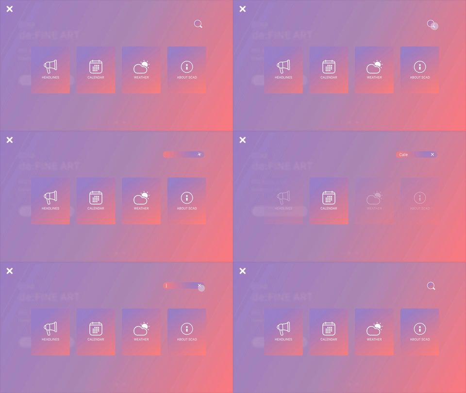
Characteristics of Microinteractions:
- Purposeful Engagement:
Microinteractions serve a specific purpose, such as confirming an action, providing feedback, or guiding users through a process. They add meaning and context to user interactions, making them feel intentional and intuitive.
- Subtle and Seamless:
Microinteractions are discreet and non-intrusive, complementing the overall user experience without overshadowing the primary content. They seamlessly integrate into the interface, enriching the interaction without distracting the user.
- Feedback and Response:
Microinteractions offer real-time feedback to users, confirming successful actions or indicating errors. They create a sense of responsiveness, assuring users that their interactions are recognized and processed.
- Enhancing User Enjoyment:
Well-crafted microinteractions evoke positive emotions and add an element of delight to the user experience. They can create a sense of surprise, playfulness, or satisfaction, fostering a more engaging and memorable digital journey.
Advantages of Microinteractions:
- Improved User Engagement:
Microinteractions encourage users to interact more actively with the interface by offering clear feedback and making interactions feel rewarding. This heightened engagement leads to increased time spent on the website or application.
- Enhanced User Experience:
Microinteractions create a positive user experience, making interactions more intuitive and smoother. They reduce confusion and frustration, guiding users through the interface seamlessly.
- Brand Personality and Differentiation:
Thoughtful and unique micro interactions can infuse a brand’s personality into the digital experience, creating a distinct identity and setting the website or application apart from competitors.
- Increased Conversions:
Microinteractions can influence user behaviour and encourage desired actions, improving conversion rates and user retention.
Future Trends and Techniques Related to Microinteractions in 2023:
As web design evolves in 2023, micro interactions will likely become more sophisticated and immersive, thanks to technological advancements and design tools. Here are some potential future trends and techniques related to microinteractions:
- Context-Aware Interactions:
Microinteractions may become context-aware, adapting to users’ behaviour and preferences. For example, the interface could adjust animation speed or complexity based on user interactions or device capabilities.
- Integrated Voice and Gesture Control:
Voice and gesture-controlled micro interactions may become more prevalent, allowing users to interact with the interface through natural language or physical gestures.
- Microinteractions for Emotional Well-being:
Web designers may explore incorporating micro-interactions that promote emotional well-being, such as calming animations or interactive elements aimed at reducing stress or anxiety.
- Personalization and User Preference:
Microinteractions could be personalized based on user preferences, creating a more tailored and customized user experience.
- Microinteractions for Accessibility:
Designers will continue to focus on making microinteractions accessible to all users, ensuring that they provide meaningful feedback for individuals with disabilities.
Microinteractions add delightful details to the user experience, improving engagement, enhancing usability, and strengthening brand identity. As we look ahead to future web design, micro interactions are expected to become even more sophisticated and integrated into the user interface, creating seamless and enjoyable digital interactions across various devices and platforms.
6. 3D/Immersive Experiences: Stepping into a New Dimension:
3D/Immersive experiences in web design refer to incorporating three-dimensional elements, interactive animations, and virtual reality (VR) or augmented reality (AR) technologies to create engaging and lifelike digital environments. This innovative approach to web design aims to provide users with an immersive and captivating experience beyond the traditional two-dimensional web interface. As we look ahead to future web design trends and techniques in 2023, 3D and immersive experiences are poised to redefine how users interact with websites and applications.
Reference: Admireamaze de Bijenkorf
Characteristics of 3D/Immersive Experiences:
- Realism and Depth:
3D elements add depth and realism to the user interface, making objects and scenes look more tangible and lifelike. Users can feel like they interact with three-dimensional objects instead of flat images.
- Interactive Animation:
Immersive experiences often involve interactive animations and effects that respond to user actions, creating a sense of interactivity and exploration.
- Spatial Navigation:
In immersive experiences, users can navigate and explore the virtual environment in a spatial manner, similar to how they would in a physical space.
- VR and AR Integration:
Specific 3D/Immersive experiences integrate virtual reality (VR) or augmented reality (AR) technologies, enabling users to completely immerse themselves in a virtual world or overlay digital elements onto the real world.
Advantages of 3D/Immersive Experiences:
- Enhanced User Engagement:
Incorporating 3D and immersive experiences captures users’ attention and sustains their engagement for extended periods. The interactivity and realism of the environment create a more memorable and enjoyable experience.
- Personalization and Customization:
Immersive experiences can be personalized to suit individual preferences and needs, allowing users to tailor their interactions and explore content in a way that suits them best.
- Product Visualization:
For e-commerce websites, 3D and immersive experiences enable users to visualize products more realistically and interactively, leading to improved decision-making and potentially higher conversion rates.
- Brand Differentiation:
Incorporating 3D elements and immersive technologies can set a brand apart from competitors, creating a unique and cutting-edge brand identity.
Future Trends and Techniques related to 3D/Immersive experiences in 2023:
As technology advances, 3D and immersive experiences are expected to become more accessible and widespread in web design. Here are some potential future trends and techniques related to 3D/Immersive experiences in 2023:
- WebXR Integration:
WebXR, which stands for Web Extended Reality, is a set of APIs enabling web browser VR and AR experiences. Web designers may leverage WebXR to create more seamless and cross-platform immersive experiences.
- Social Interaction in VR:
Websites and applications may incorporate social VR experiences, allowing users to interact with each other in virtual environments, attend events, or collaborate on projects.
- Enhanced Realism:
Advancements in 3D modeling and rendering technologies may lead to even more realistic and visually stunning 3D elements, blurring the lines between the virtual and real worlds.
- Responsive Immersive Design:
Designers may develop responsive, immersive Design techniques to ensure that the experience adapts seamlessly to various devices, including VR headsets, AR glasses, and traditional screens.
- Accessibility and Inclusivity:
Efforts will be made to ensure that 3D/Immersive experiences remain accessible to all users, including those with disabilities, by implementing features such as voice commands and customizable interfaces.
“3D/Immersive experiences represent a groundbreaking shift in web design, offering users captivating and interactive digital environments.” As technology evolves and becomes more accessible, these immersive experiences are expected to become a defining aspect of future web designs. By providing a unique and engaging way to explore content and interact with digital elements, 3D and immersive experiences will continue to redefine the boundaries of user experience on the web.
7. Minimalist and Clean Designs: Less is More:
Minimalist and clean web design focuses on simplicity, clarity, and the strategic use of white space to create a visually appealing and uncluttered user interface. This design philosophy embraces the “less is more” principle, where unnecessary elements are removed, and essential components are emphasized. Minimalism is a timeless and enduring trend in web design, and its significance is expected to grow further as we look ahead to future web design trends and techniques in 2023.
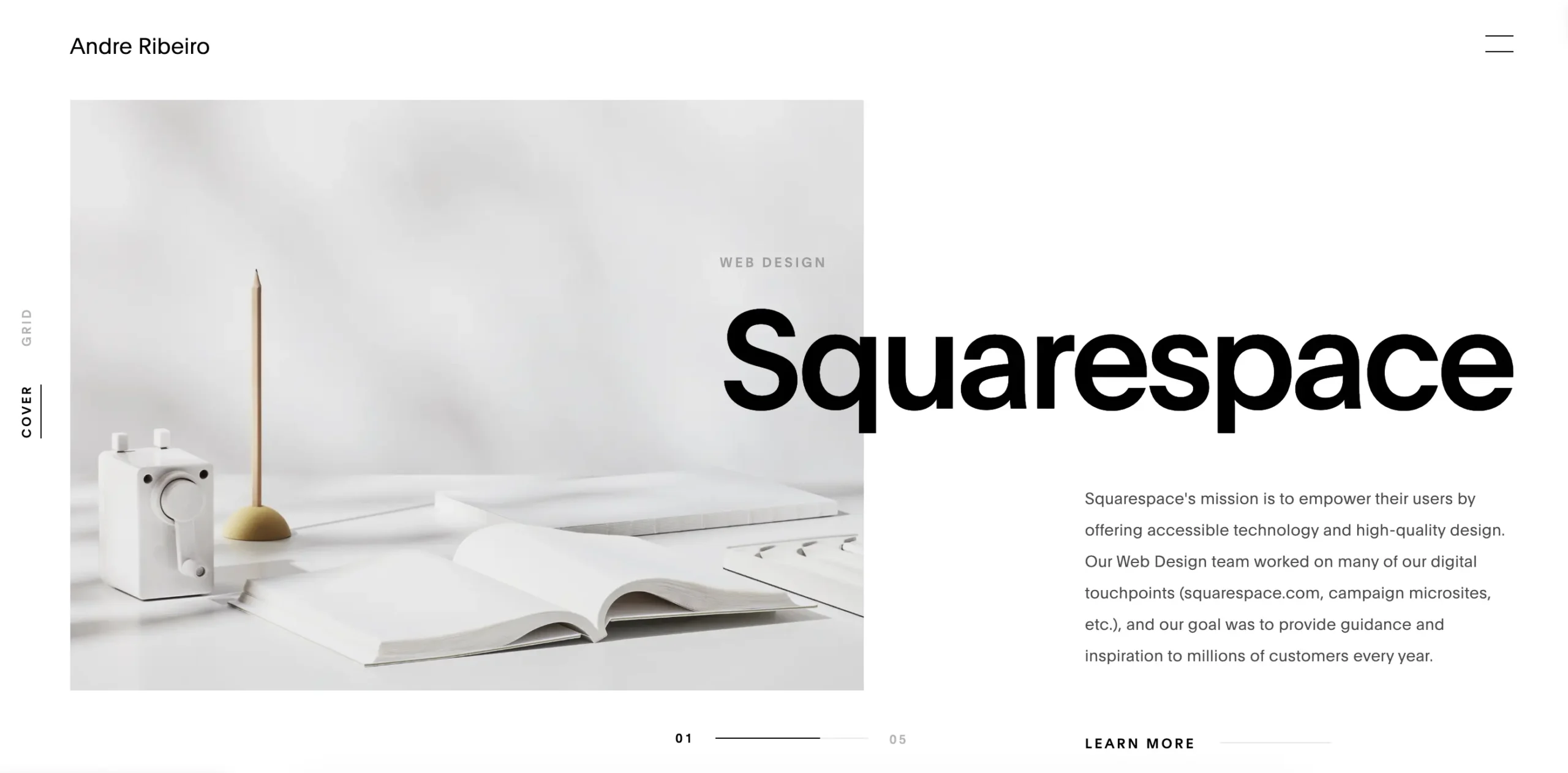
Reference: Andre Ribeiro
Characteristics of Minimalist and Clean Designs:
- Simplicity:
Minimalist designs prioritize simplicity, focusing on clear and concise visual elements. Using minimal colors, fonts, and textures creates a sense of elegance and sophistication.
- White Space:
White space, also called negative space, is crucial in minimalist designs. It provides breathing room between elements, enhances readability, and draws attention to key content.
- Clear Typography:
Clean and readable typography is a crucial aspect of minimalist designs. Large and well-spaced fonts ensure that content is easily legible and accessible.
- Functional Navigation:
Minimalist designs often feature intuitive and straightforward navigation, guiding users through the interface with clarity and ease.
Advantages of Minimalist and Clean Designs:
- Focus on Content:
By reducing visual distractions, minimalist designs direct users’ attention to the essential content and message, improving content comprehension.
- Faster Loading Times:
With fewer complex design elements, minimalist websites load faster, enhancing user experience and reducing bounce rates.
- Timeless Appeal:
Minimalist designs have a timeless quality that remains relevant and visually appealing even as design trends change.
- Mobile-Friendly:
Minimalist designs naturally lend themselves to responsive web design, making them mobile-friendly and accessible on various devices.
Future Trends and Techniques Related to Minimalism in Web Design in 2023:
As we approach 2023, minimalist and clean designs will likely evolve to meet the needs and preferences of users. Here are some potential future trends and techniques related to minimalism in web design:
- Incorporating Microinteractions:
Minimalist designs may include subtle micro-interactions to enhance user engagement and add delightful details without compromising simplicity.
- Creative Use of White Space:
Designers may experiment with creative layouts and the use of white space to create unique and visually engaging compositions.
- Minimalist Illustrations and Graphics:
Custom-made illustrations and simple graphics can add a touch of creativity to minimalist designs while maintaining a clean and uncluttered look.
- Dark Mode Minimalism:
Minimalist designs may adapt to Dark Mode, giving users a sleek and elegant experience when they prefer a darker color scheme.
- Accessibility-Focused Design:
Web designers will continue to prioritize accessibility, ensuring that minimalist designs remain inclusive and usable for all users.
“Minimalist and Clean Designs epitomize the “less is more” approach, offering an elegant, uncluttered user experience.” As we anticipate future web design, minimalism is expected to remain a popular choice for creating visually appealing, user-friendly, and timeless web interfaces. By focusing on essential elements, emphasizing content, and prioritizing user experience, minimalist designs will continue to be a staple in web design, reflecting the enduring appeal of simplicity and elegance in the digital landscape.
8. Custom Illustrations and Graphics: Uniqueness and Branding:
Custom illustrations and graphics in web design refer to original and bespoke visual elements explicitly created for a website or brand. These unique and tailor-made graphics set a website apart, creating a distinctive and memorable brand identity. As we look ahead to future web design trends and techniques in 2023, custom illustrations and graphics are expected to play an even more significant role in enhancing uniqueness, branding, and overall user experience.
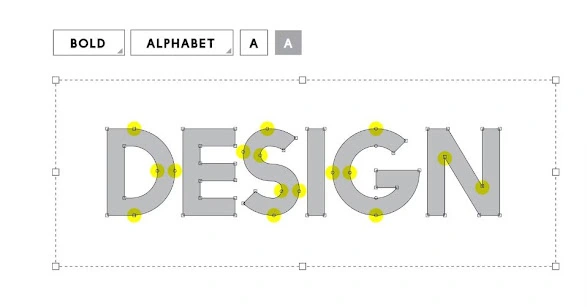
Characteristics of Custom Illustrations and Graphics:
- Brand Alignment:
Custom illustrations and graphics are designed to align perfectly with the brand’s identity, tone, and values. They contribute to a cohesive visual language reinforcing the brand’s message and personality.
- Uniqueness:
Unlike stock images or generic graphics, custom illustrations and graphics are one-of-a-kind creations, ensuring that the website stands out from competitors and leaves a lasting impression on users.
- Flexibility:
Custom graphics can be tailored to suit different contexts and platforms, maintaining consistency across various marketing materials and social media channels.
- Storytelling:
Custom illustrations have the potential to tell a brand’s story or communicate complex concepts visually, making the content more engaging and accessible to users.
Advantages of Custom Illustrations and Graphics:
- Brand Identity:
Custom graphics allow a brand to establish a solid and recognizable visual identity that resonates with its target audience.
- Originality:
Custom illustrations and graphics reflect a brand’s individuality and creativity, setting it apart from competitors that rely on generic visuals.
- Enhanced User Experience:
The use of custom graphics can enhance user engagement and navigation by adding an element of delight and surprise to the website.
- Memorability:
Unique and well-designed custom graphics leave a lasting impression on users, making the brand more memorable and increasing the likelihood of returning visitors.
Future Trends and Techniques Related to Custom Illustrations and Graphics in 2023:
As we move into 2023, custom illustrations and graphics are poised to become even more prominent in web design, driven by technological advancements and designers’ increasing focus on creating unique brand experiences. Here are some potential future trends and techniques related to custom illustrations and graphics:
- Immersive Visual Storytelling:
Websites may incorporate custom illustrations and graphics to create immersive visual storytelling experiences, taking users through the brand’s narrative.
- Mixed Media Art:
Designers may experiment with a combination of custom illustrations, photography, and other art forms to create mixed-media visuals that add depth and complexity to the website.
- Animated Custom Graphics:
Custom graphics with subtle animations or interactive elements can elevate the user experience, providing dynamic and engaging visual content.
- 3D Custom Illustrations:
With 3D technology becoming more accessible, custom 3D illustrations may be integrated into web design to provide users with a more interactive and realistic experience.
- Illustrated Branding Assets:
Custom illustrations may extend beyond the website, becoming integral to a brand’s overall visual identity, including logos, social media assets, and marketing materials.
Custom Illustrations and Graphics are instrumental in shaping a brand’s identity and enhancing website user experience. As we anticipate future web designs, the use of custom graphics is expected to grow, driven by the desire to create distinctive and authentic brand experiences. By leveraging unique visuals that align with the brand’s personality and values, businesses can leave a lasting impression on users and establish a robust online presence that stands out in an increasingly competitive digital landscape.
9. Mobile-First and Responsive Designing: Prioritizing Mobile Experiences:
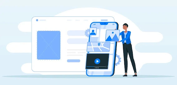
Mobile-First and Responsive Design are two closely related web design approaches that focus on delivering optimal user experiences on mobile devices. As smartphones and tablets are widely used, ensuring websites are mobile-friendly and responsive to different screen sizes has become essential. These design philosophies prioritize the needs of mobile users first, ensuring that websites are accessible, functional, and visually appealing across all devices. As we look ahead to future web design trends and techniques in 2023, Mobile-First and Responsive Design are expected to gain even more significance in the digital landscape.
Mobile-First Design:
Mobile-First Design is a design strategy where web designers create and optimize the website for mobile devices and then scale it up for larger screens. This approach acknowledges the dominance of mobile users and ensures that the user experience on smaller screens is smooth and efficient. Mobile-First Design focuses on simplicity, fast loading times, and intuitive navigation for mobile users.
Responsive Designing:
Responsive Designing is a design approach in which websites are developed to automatically adjust and adapt to screen sizes and resolutions. Responsiveness can fluidly adjust their layout and content based on the device being used by using flexible grids, images, and CSS media queries. This ensures that users have a consistent and user-friendly experience, whether they access the website on a smartphone, tablet, laptop, or desktop computer.
Characteristics of Mobile-First and Responsive Design:
- Optimized Mobile Experience:
Both approaches prioritize mobile users, offering them a seamless and optimized experience, which leads to increased engagement and improved conversion rates.
- Consistent Branding:
Mobile-First and Responsive Design ensure that the brand’s identity, visuals, and messaging remain consistent across all devices, reinforcing brand recognition and trust.
- Accessibility:
By prioritizing mobile users, websites become more accessible to a broader audience, including those with limited internet connectivity or users with disabilities.
- Improved Performance:
Mobile-First and Responsive websites have faster loading times and lower bounce rates, contributing to better search engine rankings and user satisfaction.
Advantages of Mobile-First and Responsive Design:
- Mobile User Dominance:
With mobile devices accounting for a significant portion of internet traffic, Mobile-First and Responsive Design cater to most users.
- Future-Proof:
As the number of mobile users grows, designing with a Mobile-First and Responsive approach ensures websites are prepared for the evolving digital landscape.
- Better SEO:
Google and other search engines prioritize mobile-friendly websites in their search results, making Mobile-First and Responsive sites more likely to achieve higher rankings.
Future Trends and Techniques Related to Prioritizing Mobile Experiences in 2023:
As we approach 2023, Mobile-First and Responsive Design will persistently evolve and adjust to embrace emerging technologies and user behaviors. Here are some potential future trends and techniques:
- Enhanced Mobile Interactions:
Websites may incorporate touch-based interactions and gestures to create more engaging and intuitive mobile experiences.
- Accelerated Mobile Pages (AMP):
The adoption of AMP technology may increase, allowing websites to load even faster on mobile devices.
- Progressive Web Apps (PWAs):
PWAs that provide an app-like experience on the web will become more popular, blurring the lines between websites and native mobile applications.
- AR and VR Integration:
As AR and VR technologies advance, websites may start incorporating these immersive elements, especially for mobile users.
- Mobile-First E-commerce:
E-commerce websites will increasingly adopt Mobile-First and Responsive Designs to accommodate the growing mobile shopping trend.
Mobile-First and Responsive Design have become indispensable for successful web design, given the prominence of mobile devices in today’s digital landscape. As we anticipate future web design, these approaches will continuously evolve to support the requirements of mobile users, ensuring that websites consistently deliver outstanding user experiences across all devices. By prioritizing mobile users and leveraging responsive design principles, businesses can stay ahead of the curve and create websites that remain accessible, functional, and visually appealing to users in the mobile-centric era.
10. Voice User Interface (VUI): A Voice-Enabled Future:
Voice User Interface (VUI) is a technology that allows users to interact with digital devices and applications using naturally spoken language. As voice assistants such as Siri, Alexa, and Google Assistant become more prevalent, VUI has gained significant traction and is expected to play a transformative role in future web design trends and techniques in 2023. VUI enables users to access information, perform tasks, and navigate websites hands-free, making it a convenient and accessible option for many users, including those with disabilities and those on the go.
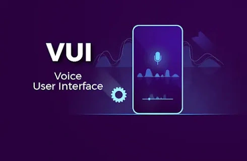
Characteristics of Voice User Interface (VUI):
- In Natural Language Processing:
In Natural Language Processing (NLP) it is used to understand and interpret spoken commands and queries, enabling more human-like interactions.
- Conversational Experience:
Furthermore it is designed to facilitate natural conversations and allowing users to interact with devices and in addition to websites in a way that feels intuitive and familiar equally important.
- Hands-Free Interaction:
In Addition it provides a hands-free and eyes-free user experience and making it ideal for scenarios where users cannot physically interact with devices, such as driving or cooking too.
- Multimodal Integration:
It can be integrated with other modes of interaction, such as touch or gestures, creating a seamless and versatile user experience.
Advantages of Voice User Interface (VUI):
- Accessibility and Inclusivity:
VUI enhances accessibility for users with visual impairments, motor disabilities, or language barriers, ensuring a more inclusive web experience.
- Improved User Engagement:
VUI’s conversational and interactive nature fosters deeper user engagement and may increase the time users spend on websites.
- Speed and Efficiency:
Voice commands allow users to access information or perform tasks quickly without typing or navigating complex menus.
- Personalization:
VUI can leverage user data to deliver personalized experiences and recommendations based on individual preferences.
Future Trends and Techniques Related to Voice User Interface in 2023:
As we approach 2023, VUI is expected to advance and equally important integrate further into web design too. Here are some potential future trends and techniques related to Voice User Interface:
- Voice Search Optimization:
Websites may focus on optimizing their content for voice search queries and in addition understanding users’ conversational language while interacting with VUI.
- Voice-Enabled E-commerce:
E-commerce websites may integrate VUI to provide voice-based product searches, personalized recommendations, and seamless voice-enabled checkout processes.
- Voice-Enhanced Customer Support:
Websites may offer voice-enabled customer support features, allowing users to resolve queries and issues through voice interactions.
- Contextual Understanding:
Advancements in NLP may enable VUI to understand the context of conversations better, leading to more accurate responses and a more natural interaction flow.
- Security and Privacy:
Web designers will prioritize user data security and privacy in VUI implementations, ensuring that voice interactions comply with data protection regulations.
“Voice User Interface (VUI) is poised to revolutionize future web design and user interactions.” As we anticipate web design trends and techniques in 2023, the adoption of VUI is expected to grow, transforming how users interact with websites and applications. By providing a more accessible, engaging, and efficient user experience, VUI opens up new possibilities for businesses to connect with their audiences and deliver seamless, voice-enabled interactions that cater to the needs and preferences of users in the voice-enabled future.
11. Sustainability and Eco-Friendly Design: Designing for a Better Future:
Sustainability and eco-friendly design are increasingly becoming essential considerations in web design. As the world faces pressing environmental challenges, businesses and designers recognize the importance of creating websites with minimal ecological impact. Sustainable web design aims to reduce energy consumption, and in addition carbon emissions, and futhermore environmental footprint while delivering an engaging and efficient user experience too. Looking ahead to future web design trends and techniques in 2023, sustainability and eco-friendly design are expected to take centre stage, with an increased emphasis on environmentally responsible practices.
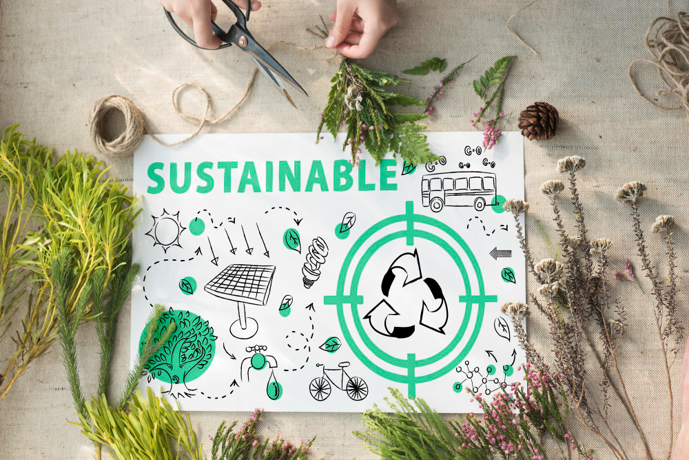
Characteristics of Sustainability and Eco-Friendly Design:
- Efficient Energy Use:
Sustainable web design prioritizes energy-efficient technologies and in addition to practices, furthermore such as optimizing code, compressing images, and reducing unnecessary scripts equally important, to minimize the energy consumption of websites.
- Reduced Carbon Footprint:
The eco-friendly design reduces carbon emissions associated with web hosting and data centres, often by choosing eco-friendly hosting providers or using renewable energy sources.
- Resource Conservation:
Sustainable web design considers the impact of digital assets on resources like bandwidth and storage, aiming to minimize waste and excess usage.
- Accessibility and Inclusivity:
Eco-friendly Design ensures that websites are accessible to all users, including those with disabilities, providing a more inclusive user experience.
Advantages of Sustainability and Eco-Friendly Design:
- Positive Brand Image:
Adopting sustainable practices in web design can enhance a brand’s reputation and demonstrate a commitment to environmental responsibility, attracting environmentally conscious users.
- Cost Savings:
Energy-efficient web design can reduce hosting costs and lower energy bills, benefiting businesses and the environment.
- User Engagement:
An increasing number of users are concerned about environmental issues. Websites can engage and resonate with these environmentally conscious audiences by demonstrating eco-friendly practices.
- Regulatory Compliance:
As environmental regulations evolve, businesses that prioritize sustainability in web design may be better prepared to meet future compliance requirements.
Future Trends and Techniques Related to Sustainability and Eco-Friendly Design in 2023:
As 2023 approaches and in addition to the sustainability and eco-friendly design are equally important and it can also expected to evolve with the following potential trends and techniques:
- Renewable Energy-Powered Websites:
Businesses might choose web hosting services powered entirely by renewable energy sources, like wind or solar power, to minimize their carbon footprint.
- Minimalistic Design:
Sustainable web design may embrace minimalism, focusing on essential elements and reducing visual clutter to promote faster loading times and a more eco-friendly browsing experience.
- Green Certifications:
Websites may seek green certifications or eco-labels to highlight their commitment to sustainable practices, building trust and credibility with environmentally conscious users.
- Sustainable Hosting Solutions:
Web hosting providers may offer sustainable hosting plans emphasizing energy efficiency and environmental responsibility.
- Eco-Friendly Content Strategies:
Businesses may adopt eco-friendly content creation strategies, promoting sustainable products and practices through their websites.
Sustainability and eco-friendly design are becoming integral to modern web design. As we look ahead to future web design, the demand for environmentally responsible practices is expected to grow. By embracing sustainability in web design, businesses and designers can contribute to a better future. It can be Achieved by reducing the ecological impact of websites and fostering a more eco-conscious digital landscape. Web professionals can play a significant roles in this. In shaping a more sustainable and environmentally responsible online presence by designing for a better future.
12. FAQs (Frequently Asked Questions)
Q1: Are these futuristic web design trends suitable for all types of websites?
Answer: These trends can be adapted to suit various types of websites. From personal blogs to e-commerce platforms and corporate sites.
Q2: How can I implement dark Mode on my website?
Answer: Implementing dark Mode may require CSS adjustments and media queries to detect user preferences and apply the appropriate theme.
Q3: What tools or software can help create 3D and immersive web experiences?
Answer: Various libraries and frameworks like Three.js and A-Frame facilitate the creation of 3D and immersive web experiences.
Q4: Is the minimalist design suitable for content-heavy websites?
Answer: Yes, minimalist design can be effectively used for content-heavy websites to maintain focus on essential information and improve readability.
Q5: How do I ensure my website is mobile-friendly and responsive?
Answer: Employ responsive web design techniques, use media queries, and test your website on various devices to ensure mobile-friendliness.
13. Conclusion:
As we venture into 2023, embracing futuristic web design trends and techniques. It is crucial for staying relevant in the rapidly evolving digital landscape. These innovative approaches revolutionize how we design and engage with websites. From Dark Mode and Neumorphism to 3D Experiences and Voice User Interfaces. By adopting these trends and strategies, web designers can create captivating and immersive online experiences. Furthermore it delight users and leave a lasting impression.
This detailed cornerstone content provides an in-depth exploration. And the top 10 web design trends and techniques in 2023, along with FAQs. This comprehensive guide empowers web designers, developers, and digital marketers with actionable insights, focusing on the latest innovations and strategies. It equips them to create user-centric and futuristic web experiences, paving the way for success in the competitive digital landscape.
Contact us to get more details on Latest Web Design Trends.



I think the admin of this website is truly working hard in support of his web site, since here every stuff is quality based stuff.